Tianye-Song.github.io
The original data visualization
I selected this data visualizaiton because this chart couldn’t show the audience the intended information correctly. It wants to show the sports fan what’s the relationship between the economic rate and the match number of Ishant. But the audience couldn’t receive that information by just looking at the chart with accumulated number in bar chart.
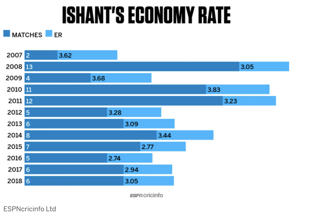
Source: https://www.espncricinfo.com/story/aakash-chopra-how-ishant-sharma-got-his-mojo-working-1156540
The title of the graph: The ISHANT’S ECONOMY RATE
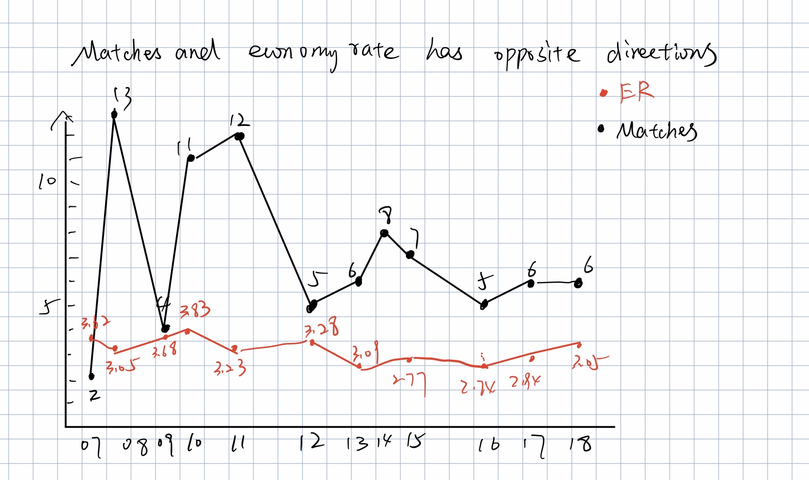
Changes I made for the first sketch:
- I changed the type of the chart from accumulated bar chart to line chart because this is a time series data, so line chart could show the trend better.
- I changed the color of the two features. The orignal color of the two features are too similar to each other for people to tell the difference of them.
- I changed the title of the chart so it could summarize the information in the chart.
The first sketch of the fixed data visualization.
Suggestions from other people:
-
People A: Use dual axis because the two features are in different scale.
-
People B: 1. Change the title 2. Delete the data points on the graph which are not useful
Changes I made after the suggestions:
- I changed the title to show accurate meaning of the graph.
- I used dual axis because of the different scales of the two features to show the trend more clearly.
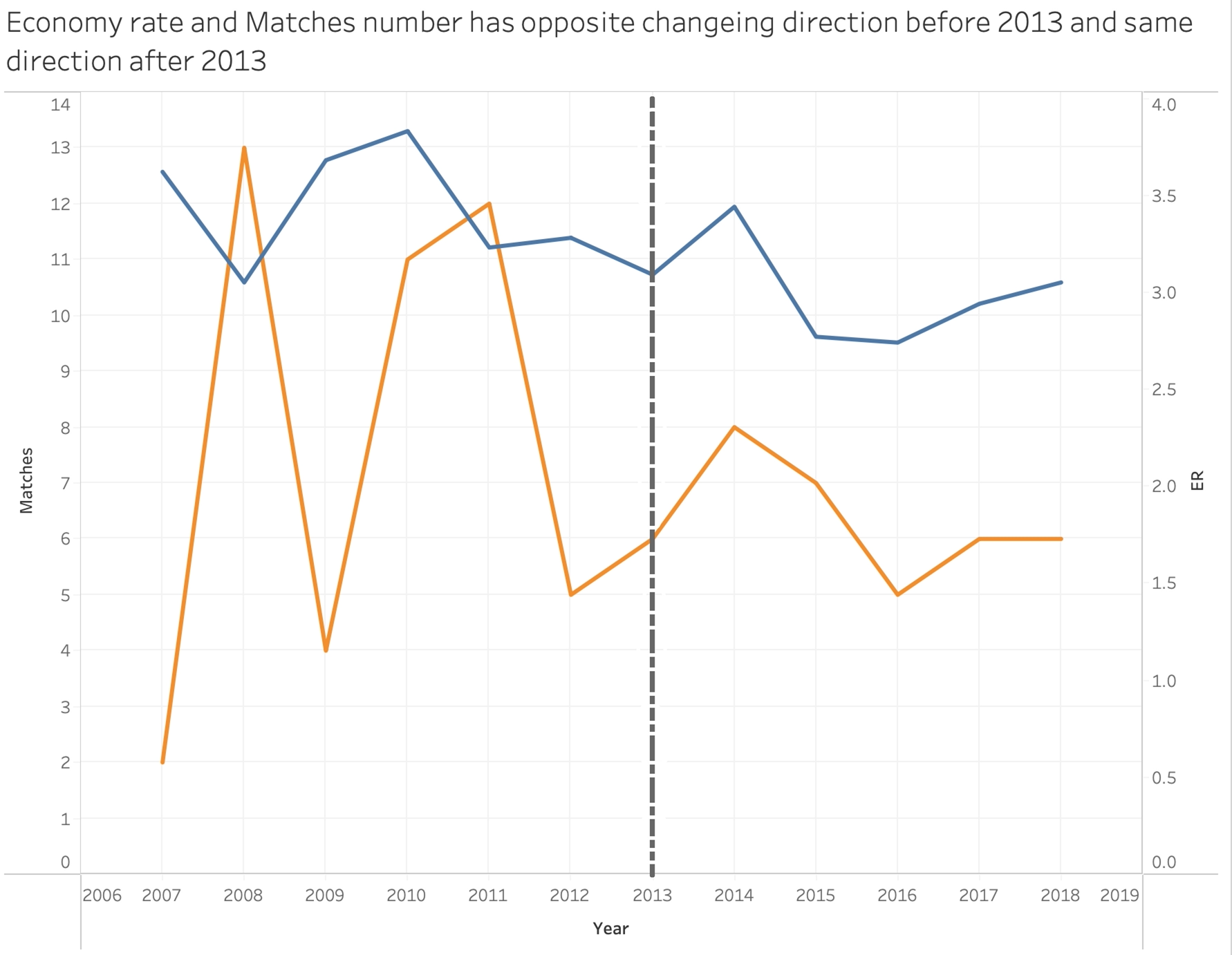
The final version of the data visualization:
I utilized line chart to show the trend of how economic rate and match number change with the year. Besides, I used dual axis because these two features are in different scale. Furthermore, I put two features in one chart to compare the difference of the trend. I also changed the title to summarize the information of the chart that the trend is in opposite way before 2013 and the same way after 2013. Last but not least, I changed the color of the two features to make the comparision clearer.

After the discussion in class, students of the group gave me two excellent advice on the chart.
- Change the background color of axis x from blue to white.
- Point out 2013 which is a turning point in this case.
Data Visualization after changes according to the suggestions from class